August 5, 2022 —
Finally…
2022 has been less than ideal for stock market investors, but finally the stars aligned (perhaps helped along by the technological wizardry of the James Webb Telescope whose first images were also released this month) and July yielded a positive month for risk assets at long last. QuantStreet too turned in a respectable performance, up 7.76% on a post-fee basis. That’s better than our benchmark (the MSCI All Country World Index) by 0.73% in July, bringing our post-fee outperformance relative to ACWI to just under 5% since our launch in December of 2021.[1]
Our regular readers will recall that QuantStreet moved its cash position into investment grade bonds at the end of June (perhaps helped along by our own little bits of technological wizardry that screamed that the asset class was a buy), and the fact that this asset class was up 3.92% in July certainly helped our performance. Also notable was the extremely strong performance of technology stocks in July, with the tech-heavy NASDAQ index up a whopping 12.39%! REITs did well too and our allocation to that sector also contributed positively to performance.
Performance
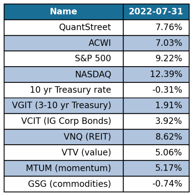
This table shows July returns for QuantStreet and associated asset classes. (Source: QuantStreet and Bloomberg.)
| Performance note: Since inception, QuantStreet has outperformed our benchmark (ACWI) by 4.97% on an after-fee basis. We have also outperformed the S&P by 2.67% on an after-fee basis. As we have explained in prior emails, QuantStreet does not run a market neutral strategy. Our strategy follows the markets. When markets are up, we’ll generally be up; when markets are down, we’ll generally be down. Over time, our goal is to be down less when markets are down and up more when markets are up. Since the time of our launch, ACWI is down 10.97% while QuantStreet is down 6.01%. |
All clear?
Just in case you are planning to crawl out from under the kitchen table and call an “all clear” on this year’s market rout, keep in mind we still have a bit of an inflation problem (last month’s green shoots notwithstanding) with a Federal Reserve Bank that is very much committed to bringing inflation under control before it becomes embedded in investors’ long-term expectations. Towards that end, the Fed raised rates by 75 basis points at the July 27th FOMC meeting, and the twos-tens curve is now inverted by 31 basis points.
The twos-tens curve

Source: Bloomberg.
The twos-tens curve is the difference in yields between ten-year and two-year Treasury bonds. When the twos-tens inverts, two-year rates become higher than ten-year rates which is widely interpreted to mean that tight monetary policy in the short-term (thus high two-year rates) will precipitate slower economic growth in the longer term (which lowers ten-year rates). Indeed, as market prognosticators never tire of telling you, an inverted twos-tens curve has preceded every recession in the history of humanity (or something like that). Indeed, judging by the last two negative quarter-over-quarter GDP growth numbers, we are already likely sitting in a (mini) recession.
If the oft-dreaded recession has finally arrived, why did financial markets have such a great July? To explore this puzzling development, we looked at the past 13 times that the twos-tens curve inverted (going back to 1978), and analyzed the performance of industrial production in the two-year period before and after each inversion. As expected, an inverted twos-tens curve has indeed been associated with macroeconomic slowdowns, as measured by industrial production (IP), a monthly series that tracks economic activity. IP typically dips a few months after the twos-tens curve inverts, and stays in relatively lethargic growth mode over the two subsequent years.
Industrial production around twos-tens inversion
Event study from 1978-08-31 to 2019-08-31 with 13 events
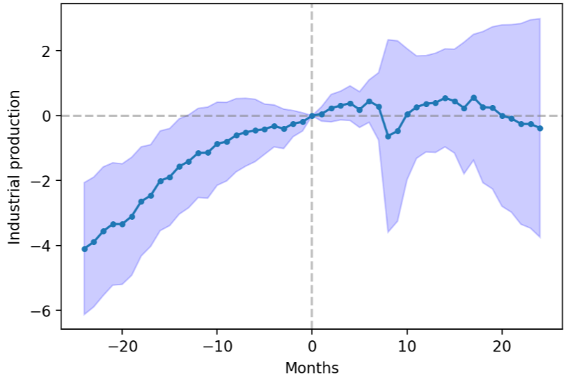
Source: QuantStreet, Bloomberg [2]
That sounds pretty bad. But wait, there’s more. We then performed the same analysis, but instead of looking at what happened to industrial production, we looked at what happened to the S&P 500 index around twos-tens inversions. Perhaps surprisingly, the stock market index, on average, performed quite well in the two-year period after the yield curve inverted (i.e., after two-year rates became higher than ten-year rates), rising by close to 20%. To make sense of this, one needs to remember that the Fed’s monetary policy, which contributes to an inverted yield curve, is endogenous. This means that the Fed does not hike rates in a vacuum, but does so during times of fast growth, strong employment, high inflation, and robust corporate profitability. Such times are typically good for corporate America and apparently also good for the stock market. If financial conditions were less rosy during times of Fed tightening, the Fed wouldn’t tighten. We’ve written in the past (see here) that stocks tend to do poorly before recessions begin, and then tend to do relatively well once economic growth actually bottoms out. The past is no guarantee of the future, but that is certainly how things seem to be playing out this time around.
S&P 500 index around twos-tens inversion
Event study from 1978-08-31 to 2019-08-31 with 13 events

Source: QuantStreet, Bloomberg [2]
How QuantStreet is positioned
As we continue to refine our analytics to better serve our clients, we now have the capability to invest in the commodity space. This means that the commodity asset class has been integrated into our analytical framework from return forecasting, to risk estimation, to portfolio optimization. Of all our asset classes, commodities have been the best performing one this year (by far), and the trend component of our return signal now favors a commodity allocation. So relative to last month, we slightly decreased our positions in investment grade bonds and REITs (though both still look attractive according to our forecasting model), increased our exposure to the S&P 500 index, and added a small position in commodities (through the GSG ETF). Given the tumultuous and tragic geopolitical backdrop of this year, an exposure to commodities has a logic that extends beyond our quantitative investment approach. Our targeted risk level continues to track our ACWI benchmark, which reflects our belief that the worst is likely behind us, but also our recognition that many risks still lurk ahead.
Notes
[1] 4.97% to be precise.
[2] The solid blue line is the average IP or SPX performance around two-tens inversions, and the shaded blue area reflects how well-estimated this average response is. A wider blue area means there is more uncertainty.